



 Post by
 In 2025, over 75% of internet traffic comes from mobile devices. If your WordPress site isn’t optimized for mobile-first design, you’re not just losing traffic—you’re losing business. At Neoline Logic, we help brands build high-performing, mobile-responsive WordPress sites that are fast, accessible, and future-ready.
What Is Mobile-First Design?
Mobile-first design means designing your website starting from the smallest screen and scaling up. Instead of adapting desktop designs for mobile, developers prioritize mobile UX, touch navigation, load speed, and responsiveness from the very beginning.
Why Mobile-First Is Essential in 2025
Google’s mobile-first indexing means your site is ranked based on its mobile version. Key reasons to go mobile-first:
- Better SEO: Google prioritizes mobile-optimized sites
- Faster Load Times: Speed matters for UX and conversions
- Lower Bounce Rates: Mobile-optimized layouts keep users engaged
- Wider Reach: Serve users on smartphones, tablets, and foldables


Top Strategies to Optimize WordPress for Mobile
Here are proven techniques we use at Neoline Logic:
- Responsive Themes: Use mobile-optimized themes like Astra, GeneratePress, or Kadence
- Image Optimization: Compress and serve next-gen formats like WebP
- Minimize Plugins: Reduce unnecessary scripts that slow down mobile speed
- Mobile-Friendly Menus: Implement collapsible, touch-friendly navigation
- AMP or PWA Support: Accelerate load times and offer app-like experiences
Use Modern Page Builders Wisely
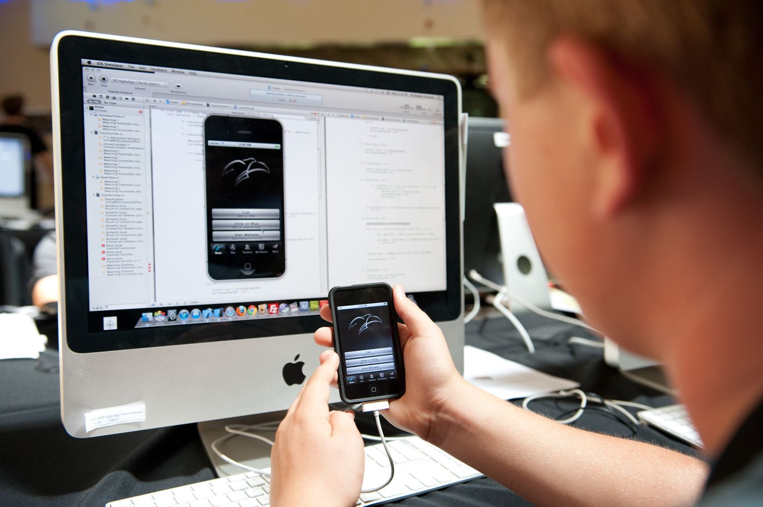
Page builders like Elementor and WPBakery must be used carefully to avoid bloated code. Always enable mobile previews, set device-specific breakpoints, and test with real devices—not just emulators.
Speed Optimization for Mobile Performance
Speed is critical for mobile users. Apply these tips:
- Use caching plugins like WP Rocket or LiteSpeed Cache
- Serve files via CDN (e.g., Cloudflare, BunnyCDN)
- Defer JavaScript and eliminate render-blocking resources
- Lazy-load images and videos
In 2025, if your website isn’t built with a mobile-first approach, it’s not just behind—it’s invisible to your users. Mobile optimization is no longer a luxury, it’s the foundation of digital success.
Testing Mobile Responsiveness
Before launch, test your WordPress site on:
- Google’s Mobile-Friendly Test
- Browser developer tools (mobile view)
- Real devices (Android, iOS, tablets)
Conclusion: Mobile-First Is the New Default
In 2025, mobile-first design isn’t optional—it’s expected. Optimizing your WordPress site for mobile-first ensures higher rankings, better user experiences, and improved ROI. At Neoline Logic, we build responsive WordPress sites that perform brilliantly across every screen size and device.